One brand, many touchpoints, an infinite number of user interfaces. No matter whether corporate website, online shop or social network – a brand has to assert itself on a variety of channels and leave a good impact everywhere.
The number of digital touchpoints for a brand is constantly increasing.
Our modern technologies have led to a paradigm shift in the way we communicate. The information unit "page", which has been generally accepted for a long time, is increasingly disappearing. It is replaced by multimedia user interfaces in which we navigate by means of various interaction processes. As a result, the requirements for the presentation of content are also changing. In addition to readability and aesthetics, usability and responsiveness play a decisive role.
Alongside the already established «content management systems», «design management systems» or short: «design systems» are now increasingly being used to help meet the growing communicative demands that users place on digital services or products.
What is their advantage?
I don't think I need to say much about the positive impact that a consistent and positively perceived brand experience has on the business value of a company.
Every marketing team and every UX professional is aware that a coherent and consistent corporate design has an enormously positive influence on the customer journey. Next to product and service quality, it is one of the most trust-building factors in terms of brand and value proposition. It determines the reputation of a company in the long term.
All the more surprising that many companies do very little to ensure the quality of their design elements and standards. Many methods and tools in this regard are often a bit old-fashioned, make use of digital bridging technologies (such as PDFs) or are characterized by significant media breaks.
In many cases, the companies themselves are not responsible for this situation. If you take a look at the development workflows of many digital agencies that supply them, you will see that their approach is very traditional and outdated.
These buttons were used on a single website. This is not an unique case, we could list many other examples here. We are wondering, how can there be so many different buttons? | Source: https://medium.com/hubspot-product
What is the reason for this?
Most frontends are still created «page template-based». For this purpose, key templates such as the start page, overview and detail pages and the content elements used on them are usually designed - first via wireframes and then via mockups. If the budget allows, a developer handoff and, if necessary, a style guide or UI documentation are created for quality assurance purposes, but these are usually only valid until the next relaunch.
This approach is neither efficient nor sustainable.
Much better would be to first develop a «modular design system» that provides designers and developers equally with components with which they can then - quasi via «drag & drop» - create a variety of templates and applications.
This not only reduces the effort and thus the cost of technical realization, but also leads to an integral harmony and consistency of the resulting solutions.

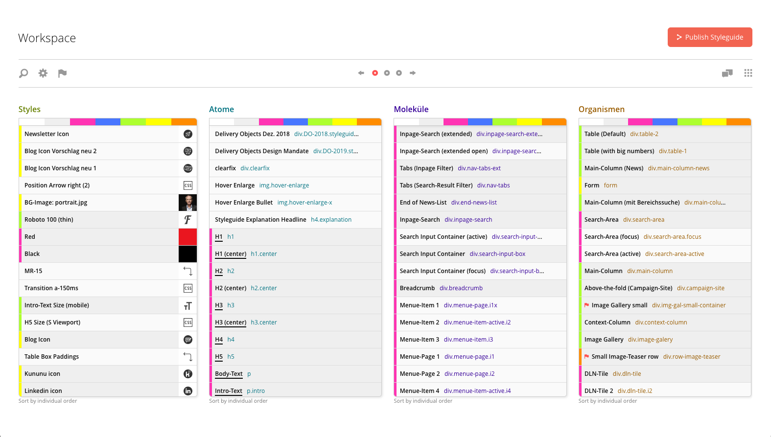
Design systems are modular
A design system differs from a style guide in that it schematizes or patterns a design. This enables a systematic and modular approach to the conceptual design of artifacts. That is why the development of a design system should be at the beginning and not at the end of the conceptual process.
A design system helps to bring continuity to a brand's user experience in the long run. Not everything has to be thrown overboard with every relaunch. An evolution of the design to the changing conditions is thereby not only possible, but makes absolute sense. Complete breaks often unsettle users and consumers more than they benefit them.
A design system is therefore the ideal tool when designers, developers and stakeholders want to communicate with each other or when different teams and agencies need to be supplied with design artifacts over a longer period of time.
A design system is built for sustained use. It scales with changing requirements and does not lose its validity with a relaunch.
Atomic Design
In the summer of 2013, the American front-end designer Brad Frost presented his new design approach «Atomic Design». This approach is based on a scientific view of design, that functional, i.e. good design should be consistent and modular in all its individual elements.
And conversely, when you look at design results through the eyes of an atomic designer, that is, if you break down a design into its smallest individual parts, all its weak points and contradictions are much more clearly visible.
In principle, this approach was not entirely new. Many designers have intuitively worked this way for a long time, and there are similar design-theoretical approaches and postulates from Gestalt theory and the Bauhaus - but in their simple metaphorics and in the application focused on websites, as Brad Frost describes his system, Atomic Design is very contemporary, plausible and above all useful.
The analogy to the physical world, in which matter is composed of atoms and molecules, which in turn form cells, which in turn form organisms, gives the model its metaphorical armor.
Thus, one begins on a small scale and then gradually works one's way up to the large scale. The advantage: one avoids inconsistencies and ensures that the design system created is of one piece. In addition, an «atomic design» is much easier to implement, since «code» follows the same principles.
AtomicKitchen
On this basis we have developed our application AtomicKitchen - because with AtomicKitchen you can create and manage an Atomic Design System in a very simple way. With its user-friendly interface, it helps designers, editors and developers in their daily work.
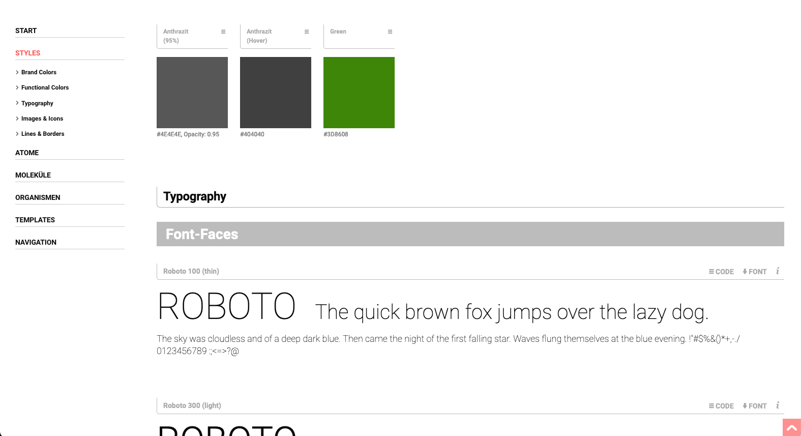
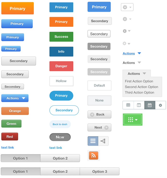
AtomicKitchen can be used to create online style guides, UI documentations, brand portals, as well as code pattern libraries that can be used as both a conceptual end result or as an iterative coordination tool between agency and client.
You and your team, and if desired of course all stakeholders, receive a complete, pixel-perfect «Look & Feel» of your future digital solution. This not only guarantees a perfect golive, but also leads to a reduction of effort to at least half of the usual effort during the technical realization of the frontend, during the necessary reviews and during the post-golive phase when the design is extended.
The code of each design element can be easily copied and pasted from the online style guide and used - the complete created design system including all necessary files can be exported and viewed offline.